SoundPass Medical
Reimagining the SoundPass Brand
Overview
As SoundPass prepared for its next round of funding, the team wanted a brand that felt as strong as the product they had built. Together, we refreshed their identity, website, and pitch deck to better tell that story.

Brand
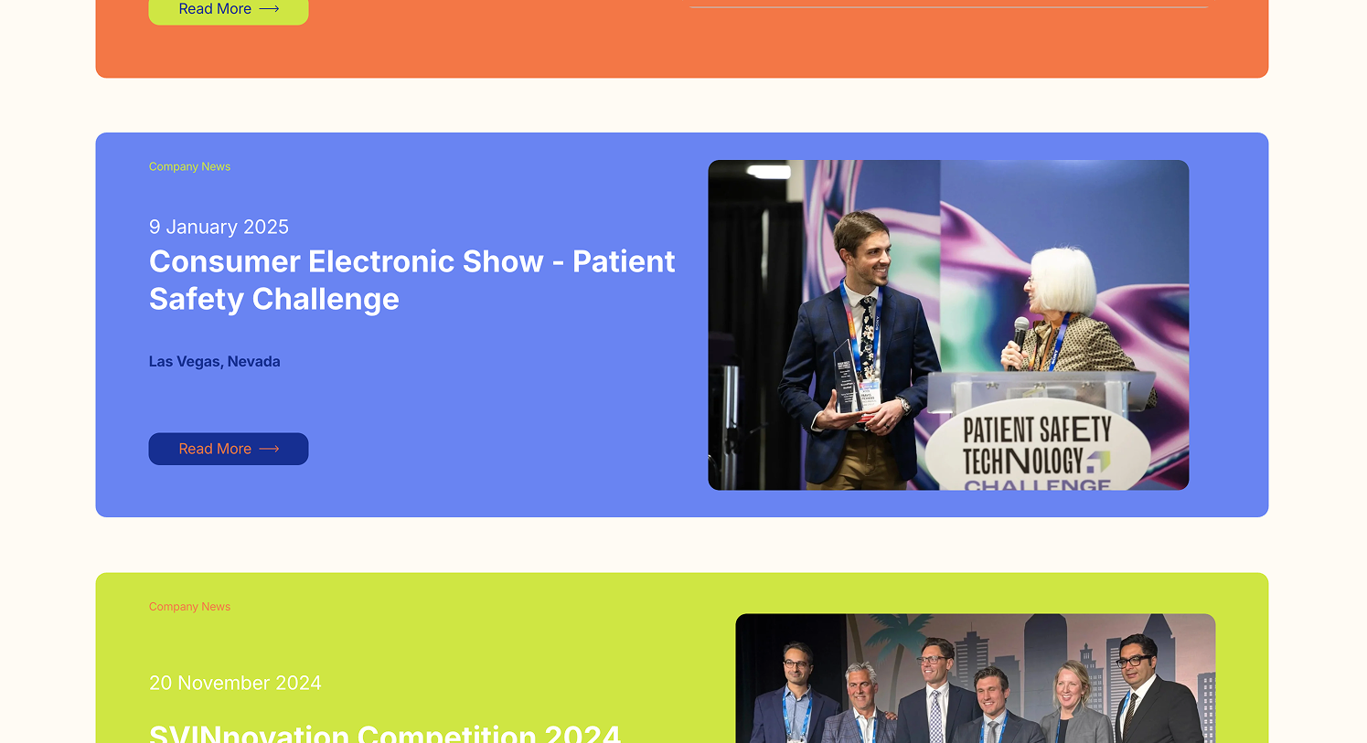
The first thing we did for the brand was choose the colors. We moved from their previous deep purple color to a fresh blue, orange, and light green. We decided to go with the classic royal blue to portray the important emotions of trust and loyalty. We went with the orange and green to set SoundPass apart from other health tech brands in the space and to provide a fresh, innovative feel. We wanted to find a balance between using identifying colors while not overwhelming the focus away from the core purpose of the product.
Refresh
A big focus of this rebrand was to build a brand that spoke to the professionalism of the team while catching the attention of investors. To achieve this we kept a clean white and black base while intentionally using pops of color in the places we wanted to really stand out.

Education
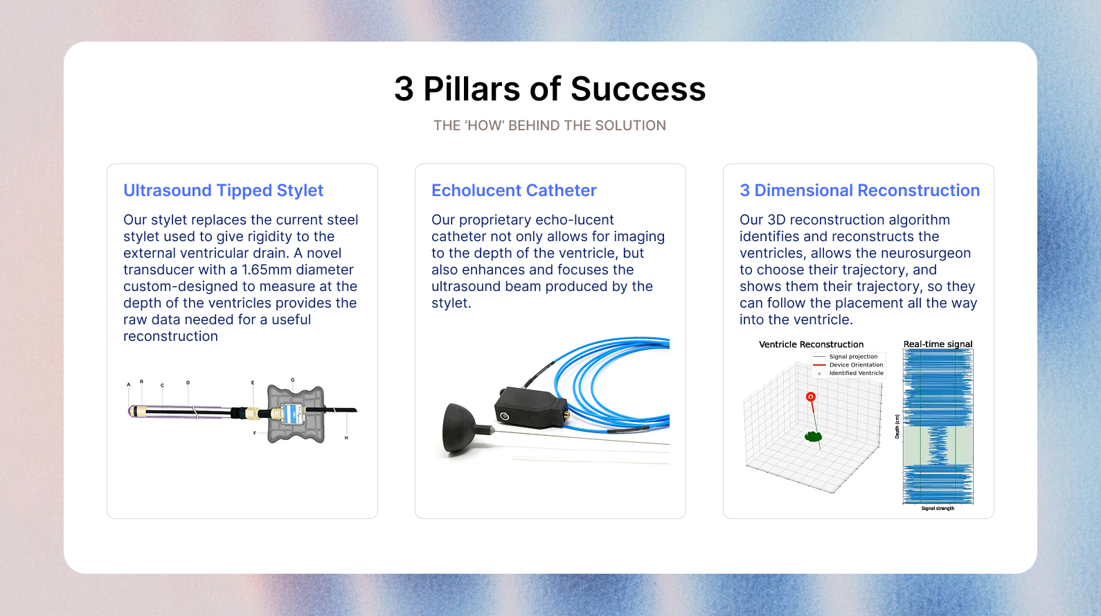
Educating the audience was a big focus as we built the website. With a complex product, simplicity was a must to help raise understanding and awareness. This was a personal favorite aspect of this project — taking something from confusing to easy is incredibly fulfilling for me.